In Camera
2015-12-11
Images
Custom made clamshell box, about 6⅞" × 6⅞" × 1⅛" holding 10 prints.


Discussion
My Portfolio Projects class was described by the instructor as a group “independent study” — each student did their own thing, with frequent critiques and readings and writing papers. It wasn’t just about the work, it was the work surrounding the work, too.
To paraphrase my original proposal, I expected to end up with twelve chemical images commenting on current trends of digital manipulation to make digital images look like they were made with film, mounted as one piece for wall hanging.
What I actually ended up with was ten chemical images, plus one digital image, plus a box.
Challenges
- Figuring out how to get the text on the negative was the first challenge, and it delayed everything else by two to three weeks. (I didn’t get my first “real” image until Roll 8.)
- Needing to make the masks from lith film (rather than inkjet or laser printing) added a step I didn’t anticipate.
- Final image selection felt scant because I didn’t have much opportunity to remake images. I’m pleased with what I have, but there’s always that nagging thought that I could have done something just a bit differently.
- Lith printing was unsatisfying because of time constraints. Slower chemistry (more diluted) made more interesting prints, but I had to go faster to get finished.
- Toning felt rushed. More time might have given me a chance to make some new prints… but then again I might have just put it off anyway.
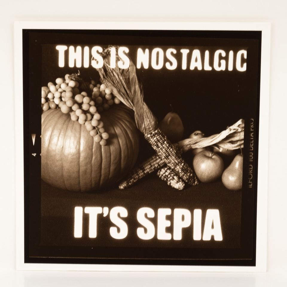
- I toned several images in three different kinds of chemicals (sepia, selenium, Berg Brown/Copper); I don’t have a good idea yet when each one is appropriate.
- Figuring out the final size of the images! I wavered from Big to Small to In Between, and even when I thought I’d figured it out (and cut the backing boards to match), I changed my mind. This meant cutting new backing boards.
- Getting the images all the same size, flush mounted on identically sized boards.
- I’ve never made a portfolio box before.
- The biggest challenge overall is dealing with the realization that I can’t “just make a new one” if I have some problem with a print. So that means I’m extra (possibly over) careful when working with the final images.
Successes
- I know of several ways to get text onto a negative before image exposure. Because of these experiments, I have two new projects in mind involving different methods and invoking different moods.
- Lith film development for graphic design purposes is pretty easy.
- I’m much more confident using medium format film and cameras.
- I know how to print and process fiber-based darkroom paper, and understand somewhat better when to use it. Future portfolio work (if chemical) is likely to use fiber paper, but class work will be RC simply for time issues.
- I made an awesome box.
- Photographers smile when they read the texts :)
What I Really Learned
It’s important for me to physically interact with the medium. For instance, my most satisfying work in my courses has included some method of presenting the image in a way other than matted and mounted on the wall. There is definitely a place for that type of presentation, and I will continue to make those sorts of prints. However, I will also always be thinking about how else my work could be presented so that I can help the viewer understand what I’m trying to say.
During the final review, I had more questions on the box than on the images. This isn’t so surprising, given that most people either dry mounted their images or put them into a Unibind book.
I used the instructions from the Library of Congress, but be warned: you should make a prototype first to make sure you understand all of the instructions. This added a few extra days to my construction, but it was well worth it because the final box fits the image plates perfectly. The box took me about a day and a half to make, mostly waiting for the glue to dry.
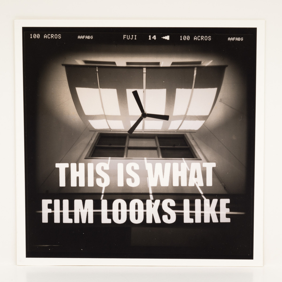
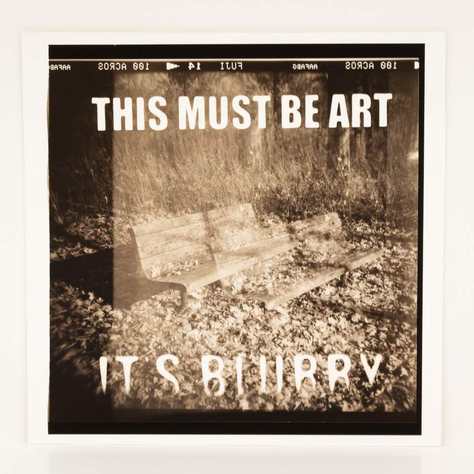
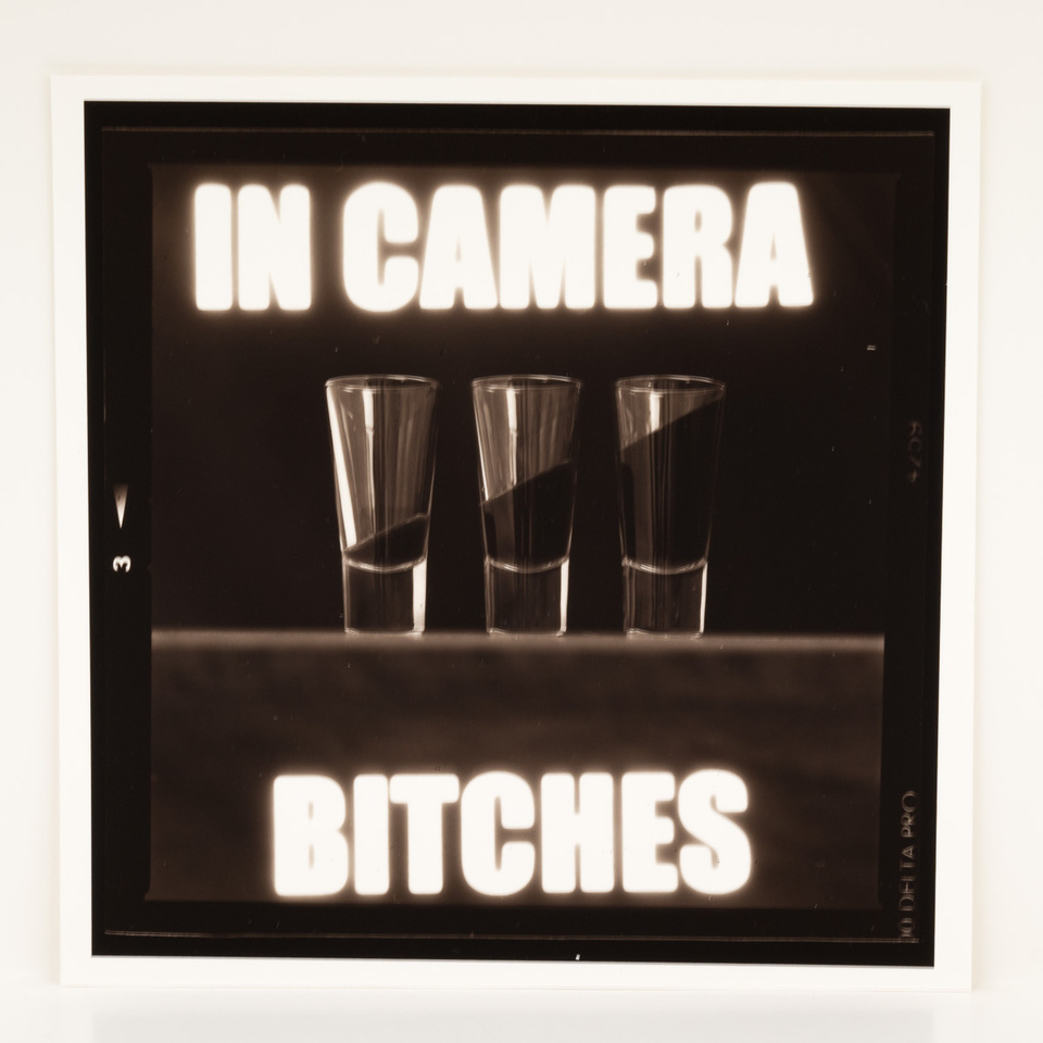
I have seen (and used) filters and processing on digital images to make them look more like film. With this project I poke a little fun at that habit, and at the same time I tease “film 4evah!” people by adding a digital-style effect to the image.
“Digital-style” means first creating an inkjet printed transparency of the text, then contact printing that onto lith (graphic arts) film to make a mask. I then take the mask and put it in the camera between the lens and the film plane, expose light through it, and then remove the mask before making the final exposure of the scene. This is why I call this work “In Camera” — everything you see in the image was created inside the camera box (with a few exceptions, like the toning color and the lith development).
The ten images inside the portfolio were created with two cameras, four kinds of medium format black and white film, two darkroom papers, two darkroom developing processes, and three types of chemical toners. The box is custom made; the cover image is an inkjet print of a digital image processed “to look like film.”
Chemical and digital photography (and all mixtures of the two) are each “real” photography. They are part of a spectrum, not a dichotomy — there is room for everyone.