Icon composer and me
2026-06-11
I’ve been attending some of the “Group Labs” at WWDC 2026, and one was about Icon Composer.
Icon Composer is sort of a weird app — you don’t exactly design icons in it, you modify existing graphics (preferably SVG) so they look good in the various Apple OSes.
So starting with this: 
I broke it into components: 


Then like in any layer-based app, I arranged them in Icon Composer
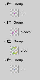
You might notice that “dot” is in there twice. I simply duplicated the original component and moved it to the bottom of the stack and enlarged it.
Everything in a “Group” gets the same treatment, so since my 4 components are each in a separate Group, they can be adjusted separately. It’s not just color — as I mentioned I resized “dot”.
I was working with Icon Composer 2.0 beta because it has some cool stuff, like you can see what your icon will look like flat, in OS26 and in OS27.
You can see it with dark and light variants, as well as a WatchOS variant. Each variant can be adjusted independently also. Then you can export all the files as pngs or you can just copy the icon file to XCode.
Anyway, I played around with it a bit today.
How cool is this though?!