Inspiration: Glass
My husband and I recently went to the Glass Pavilion at the Toledo Museum of Art. I love to visit museums, but I find it works out best when I don’t try to see everything in one go. Lucky for me, a visit to Toledo is a nice little day trip, so I can go just about whenever I get the idea.
There wasn’t a particular reason that I picked the Glass Pavilion, except for the fact that I really like glass, especially art glass. I enjoy photographing it, I love seeing how it reacts with light, I respect its materiality.
During our visit, I realized that the question of “is this a functional object or is it art” that is so prevalent in photography can also be asked about glass. The notion of “art or craft?” has been around for only a short time in art historical terms, is this “blurring” about the material, or is it more about the society in which it is made?
Ah, but that is a question for further study, and not what I wanted to share here. The particular exhibit we saw was showing glass that is held in private collections, which means pieces that aren’t often seen by the public. We also spent a few moments in the Glass Study Room and saw items in the TMA permanent collection.
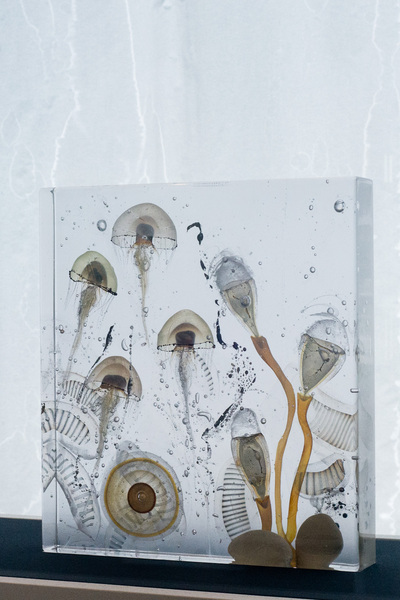
Steffen Dam, Picture Block
I liked this work by Dam because of its organic feel, and for its echo of natural history books. I photographed it with the damp-stained curtain in the background because it extended the feeling of being in the water.
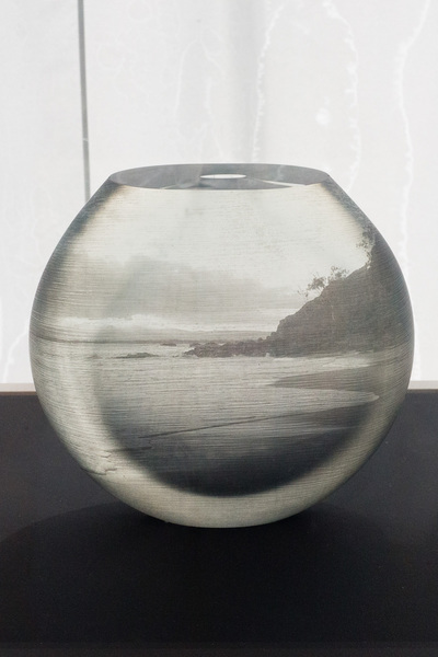
Nicole Ayliffe, Coast at Byron Bay
Ayliffe’s work is the most “photographic” of the pieces, what with the photograph being attached to the glass and all. I’m not a fan of doing image transfers, but I appreciate when others do them. This is a well-done example and makes me wonder if there are other ways to incorporate photography and glass.
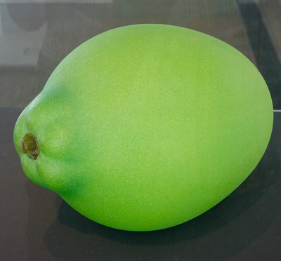
Flora Mace and Joey Kirkpatrick, Lime
Wow. This piece is about the size of a football. I also love the color — lime green is one of my favorites. I appreciate the skill involved in making this piece — it feels like it would weigh about as much as a balloon.
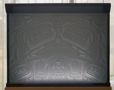
Preston Singletary, Chest
This internally-lit double-sided sculpture interprets Tlingit imagery into a different medium. A lovely way of separating “function” from “symbol”.
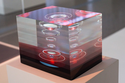
Tom Patti, Spectral Starphire
This “stacked” glass sculpture scratches my math/geometry itch.
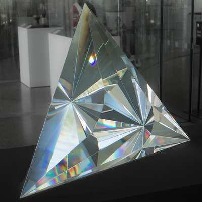
Chrisopher Ries, Point of View
Sometimes a piece surprises you with its depth. This is a wonderful example of a “smooth” surface showing more than you would expect. Each face of the sculpture (and each orientation of the viewer with respect to the surface) exposes a different geometric arrangement.
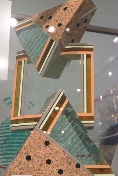
William Carlson, Pragnanz, Series II
This assemblage is in the study gallery, so it’s not the best way to appreciate it from all angles, but I like how it makes use of varied materials. It was completed in 1986, and I must say that it feels like it’s from the ’80s.
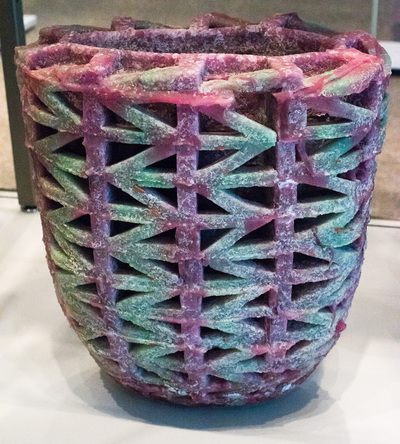
Karla Trinkley, Pink Bowl
Another one from the study gallery, this piece by Trinkley reminds me that glass is not always smooth.
The pictures here were made for my own study — I encourage you to visit the artists’ websites to see more of their work.
Artists:
- Nicole Ayliffe, Coast at Byron Bay
- William Carlson, Pragnanz, Series II
- Steffen Dam, Picture Block
- Flora Mace and Joey Kirkpatrick, Lime
- Tom Patti, Spectral Starphire
- Christopher Ries, Point of View
- Preston Singletary, Chest
- Karla Trinkley, Pink Bowl